Technical analysis: theory and important signals
Technical analysis reads price, volume and derived studies to judge the direction, strength and exhaustion of a move. Indicators do not “predict”; they summarize what has already happened, so their value comes from a repeatable process: (1) identify structure, (2) confirm trend, (3) check momentum, (4) respect volatility, and (5) demand volume confirmation.
Worked example — 0700.HK, three years
The same chart the dashboard draws. Price with moving averages and Bollinger bands on top; RSI, MACD and volume in the panels below. Hover any point to read the exact values.
0. A fast, repeatable way to read any chart (60–90 seconds)
- Timeframe & context: What is your holding period (days vs. months), and is the market trending or ranging?
- Structure first: Mark the most obvious swing highs/lows and the nearest support/resistance band.
- Trend: Is price above or below key moving averages, and are they rising/falling?
- Momentum: Is RSI/MACD confirming the move or diverging?
- Volatility: Are bands/ATR expanding (harder stops, wider swings) or contracting (breakout risk)?
- Volume: Do “important” candles (breakouts, breakdowns, reversals) print with above-average volume?
- Plan: Define entry trigger, invalidation level (stop), and target before you click buy/sell.
1. Candlesticks: what one bar can tell you
Most of the dashboard signals ultimately come from the same four numbers each bar carries: open, high, low, and close. The body shows open-to-close; wicks show extremes. Long wicks near a level often mean rejection; a series of large bodies in one direction often means urgency and trend continuation.

2. Market structure, support and resistance
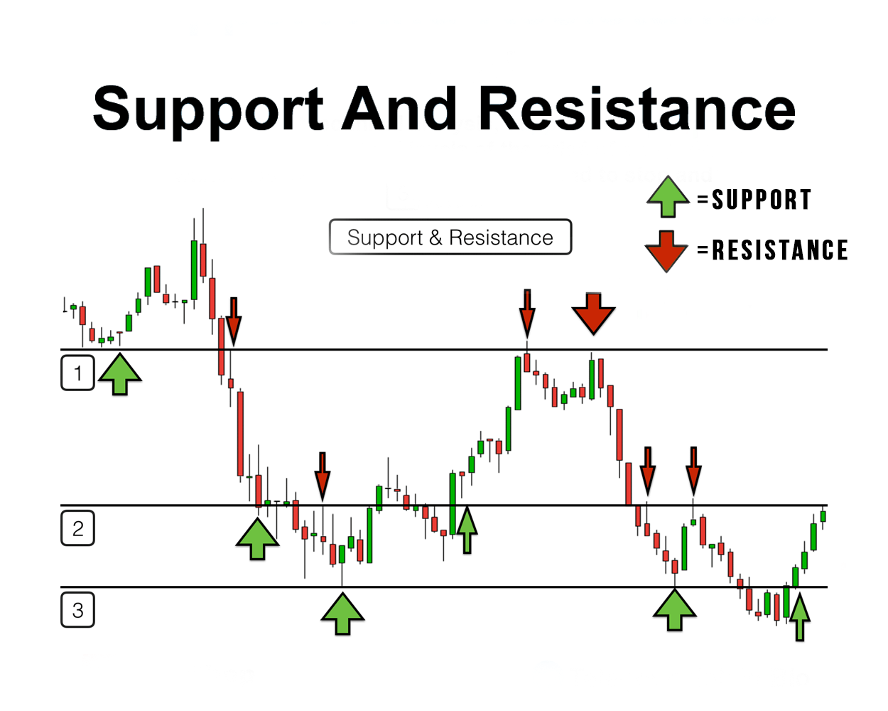
An uptrend is a sequence of higher highs and higher lows; a downtrend is the opposite. Support is a price band where buyers repeatedly appeared, resistance is where sellers did. Levels are zones (bands), not single ticks. When a key level breaks, the most informative event is often the retest: does prior resistance hold as support (bullish), or does prior support fail as resistance (bearish)?
3. Trend — moving averages (SMA/EMA)
A moving average is a smoothing line. A simple moving average (SMA) is the mean close over a window; an exponential moving average (EMA) weights recent days more heavily, so it turns sooner. Many traders use a long-period average (e.g., 200) as a rough regime filter and shorter averages (e.g., 20/50) for pullbacks and trend continuation. [8]

| Signal | What you see | Usual reading |
|---|---|---|
| Golden cross | 50-day average crosses above the 200-day | Trend turning up; slow but often steadier |
| Death cross | 50-day crosses below the 200-day | Trend turning down; risk-off |
| Stacked averages | 10 > 50 > 200, all rising | Strongest trend alignment |
| Pullback to the average | Price dips to a rising 20 or 50 and holds | Classic continuation setup |
| Slope matters | Average rises/falls clearly | Slope = regime; flat = range and chop |
4. Momentum — RSI (Relative Strength Index)
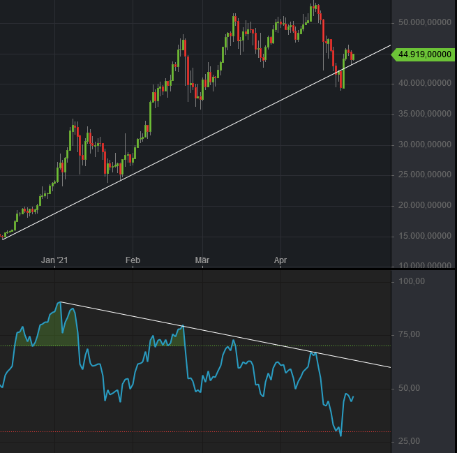
RSI is a bounded oscillator (0–100) that compares recent gains and losses (often over 14 periods). A classic reading is above 70 “overbought” and below 30 “oversold”, but extremes alone are not entries because strong trends can keep RSI elevated or depressed for long stretches. A higher-value RSI idea is divergence: price makes a new extreme while RSI fails to confirm, suggesting momentum is fading. [8]

| Signal | What you see | Usual reading |
|---|---|---|
| Bullish divergence | Lower price low, higher RSI low | Downside momentum exhausting; watch for reversal structure |
| Bearish divergence | Higher price high, lower RSI high | Rally losing power; watch for lower high / breakdown |
| 50-line cross | RSI moves through ~50 | Momentum ‘ownership’ shifting |
| Failure swing | RSI fails to reach prior extreme | Early reversal warning (needs structure confirmation) |
5. Trend plus momentum — MACD
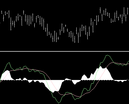
MACD is derived from the difference between two EMAs (commonly 12 and 26), plus a signal line (often a 9-period EMA of MACD). It is customarily shown with two lines and a histogram (the gap between MACD and signal). Traders often read (1) signal-line crossovers, (2) zero-line crosses, and (3) histogram expansion/contraction as momentum strengthening/weakening. [8]
| Signal | What you see | Usual reading |
|---|---|---|
| Bullish crossover | MACD line crosses above the signal line | Momentum turning up (best with structure break up) |
| Bearish crossover | MACD crosses below the signal line | Momentum turning down (best with structure break down) |
| Zero-line cross | MACD moves above/below zero | Medium-term trend change confirmation |
| Histogram fade | Histogram shrinks toward zero | Warning: momentum is decelerating |
6. Volatility — Bollinger bands and ATR
Bollinger bands are envelopes around a moving average plotted at a standard-deviation distance, so they widen when volatility rises and tighten when volatility falls. A “squeeze” (tight bands) often precedes expansion but says nothing about direction—wait for the break and then use structure (level + retest) to avoid chasing false moves. [8]

7. Volume — the confirmation most people skip
Volume is the audit trail. Breakouts on below-average volume are suspect; breakouts with strong volume are more credible. Rising price on rising volume confirms demand; rising price on falling volume warns of a thin move. Volume indicators (OBV, MFI, Accumulation/Distribution) often act as warnings via divergence rather than precise entry triggers. [8]
8. Putting it together — confluence (buy/sell/warning cheat-sheet)
A robust framework asks three questions before a trade: what is the trend on the higher timeframe, does momentum agree, and does volume confirm. Two agreeing signals at a structural level beat six indicators that all repeat the same input. [8]
- Price reclaims resistance and holds it on retest
- Trend filter improves (rising MA / bullish crossover)
- Momentum improves (RSI > ~50 or MACD histogram expands)
- Volume expands on the breakout day or the retest
- Support breaks and fails on retest from below
- Trend filter deteriorates (falling MA / bearish crossover)
- Momentum weakens (RSI fails at mid-range, MACD crosses down)
- Down days show heavier volume than up days
- Divergence (price makes new extreme; RSI/MACD fails to confirm)
- Volatility squeeze into a major level (expect expansion)
- Breakout without volume participation
- Indicators disagree across timeframes (daily bullish, weekly bearish)
Common mistakes: stacking correlated indicators, trading an oversold reading against a strong downtrend, ignoring the higher timeframe, and moving a stop after the fact.
References (APA 7)
Note: Many images below are Creative Commons Attribution-ShareAlike (CC BY-SA). If you adapt them, you must keep attribution + license and (for SA) share your derivative under a compatible license.
- Probe-meteo.com. (2013, May 12). Candlestick chart scheme 02-en [SVG image]. Wikimedia Commons. https://commons.wikimedia.org/wiki/File:Candlestick_chart_scheme_02-en.svg
- Jonlaw16. (2021, June 22). Support and Resistance [PNG image]. Wikimedia Commons. https://commons.wikimedia.org/wiki/File:Support_and_Resistance.png
- Larkin, H. (2012, April 25). Moving average crossover [PNG image]. Wikimedia Commons. https://commons.wikimedia.org/wiki/File:Moving_average_crossover.png
- Ryde, K. (2006, March 1). MACD example, fast=12 slow=26 smooth=9 [PNG image]. Wikimedia Commons. https://commons.wikimedia.org/wiki/File:MACD_example,_fast%3D12_slow%3D26_smooth%3D9.png
- Ryde, K. (2006, February 16). Bollinger bands example, 2 stddevs [PNG image]. Wikimedia Commons. https://commons.wikimedia.org/wiki/File:Bollinger_bands_example,_2_stddevs.png
- Bundesstefan. (2021, April 30). Bitcoin RSI14 Divergence [PNG image]. Wikimedia Commons. https://commons.wikimedia.org/wiki/File:Bitcoin_RSI14_Divergence.png
- shahrjerdy, E. (2013, May 3). Rsi [PNG image]. Wikimedia Commons. https://commons.wikimedia.org/wiki/File:Rsi.png
- Fidelity Brokerage Services LLC. (2020). Understanding indicators in technical analysis [PDF]. Fidelity Investments. https://www.fidelity.com/bin-public/060_www_fidelity_com/documents/learning-center/Understanding-Indicators-TA.pdf
- E*TRADE from Morgan Stanley. (2024, October 25). Understanding popular technical analysis studies. https://us.etrade.com/knowledge/library/stocks/understanding-popular-technical-analysis-studies
Educational material only, not investment advice.